Are you looking for inspiring living room color combinations to refresh your space and create the perfect mood? Choosing a color palette is arguably the most important and impactful decision you’ll make when designing your living room. Color has the power to influence our emotions, make a small room feel spacious, or turn a large, empty space into a cozy, inviting retreat.
But with an endless spectrum of shades to choose from, the process can feel overwhelming. The secret isn’t about finding one perfect color, but about creating a harmonious combination that tells a story and reflects your personal style.
This guide is designed to be your ultimate source of inspiration, showcasing 15 stunning and versatile color combinations. From serene and calming neutrals to bold and dramatic jewel tones, we’ll explore how to apply these palettes to create a stylish, cohesive, and deeply personal living room.
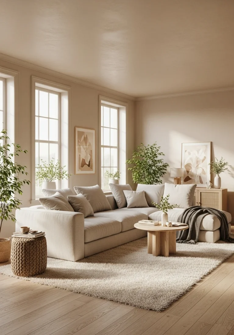
1. Cream, Beige, and Natural Wood: The Warm Minimalist
This color combination is the epitome of warm, serene, and sophisticated minimalism. By layering various shades of off-white, cream, and soft beige, you create a space that feels incredibly calm, airy, and light. The key to keeping this monochromatic palette from feeling flat or boring is to introduce the rich, organic texture and color of natural wood. The warmth of a light oak floor, a walnut coffee table, or rattan accents provides a necessary layer of depth and a connection to nature.
This is a go-to palette for clients who crave a tranquil, uncluttered retreat. It’s a hallmark of both Scandinavian and Japandi design, which prioritize natural materials and serene atmospheres. I love how this combination creates a soft, gallery-like backdrop that allows the form and texture of each furniture piece to be appreciated.
- How to Apply: Use a warm, creamy white (like Benjamin Moore’s “Swiss Coffee”) for the walls. Choose a sofa in a slightly deeper beige or a textured oatmeal fabric. Layer in your wood tones through flooring, furniture, and decorative objects.
- Mood: Calm, serene, airy, sophisticated, and organic.
- Best For: Creating a bright, minimalist, and timeless living room.
For an enhancement, add a few sharp, black accents. A thin, black metal floor lamp or the black frame of a piece of art can provide a graphic punch that grounds the soft, neutral palette and adds a modern edge.
2. Sage Green, Cream, and Brass: The Earthy & Elegant
This is a beautiful and incredibly popular color combination that feels both earthy and effortlessly elegant. Soft, muted sage green has a calming, biophilic quality that connects the room to nature. When paired with the warmth of a creamy off-white and the luxurious, warm glow of brushed brass accents, the result is a palette that is sophisticated, serene, and very inviting.
I often use this combination to create a space that feels both refreshing and cozy. The sage green acts as a “new neutral,” providing a soft wash of color that is more interesting than beige but just as versatile. As the color experts at Farrow & Ball often note, these soft, heritage greens are timeless and easy to live with.
- How to Apply: Use sage green on the walls for an enveloping feel, or on a statement piece like a velvet sofa. Use creamy white for the trim, curtains, and other furniture. Introduce brass through lighting fixtures, a mirror frame, and the legs of furniture.
- Mood: Calming, earthy, elegant, and refreshing.
- Best For: A living room that aims to be both a relaxing retreat and a sophisticated space for entertaining.
For an enhancement, incorporate a few touches of a soft, dusty pink or a warm terracotta. These colors are adjacent to green and brass on the color wheel and will add another layer of soft, earthy warmth to the palette.
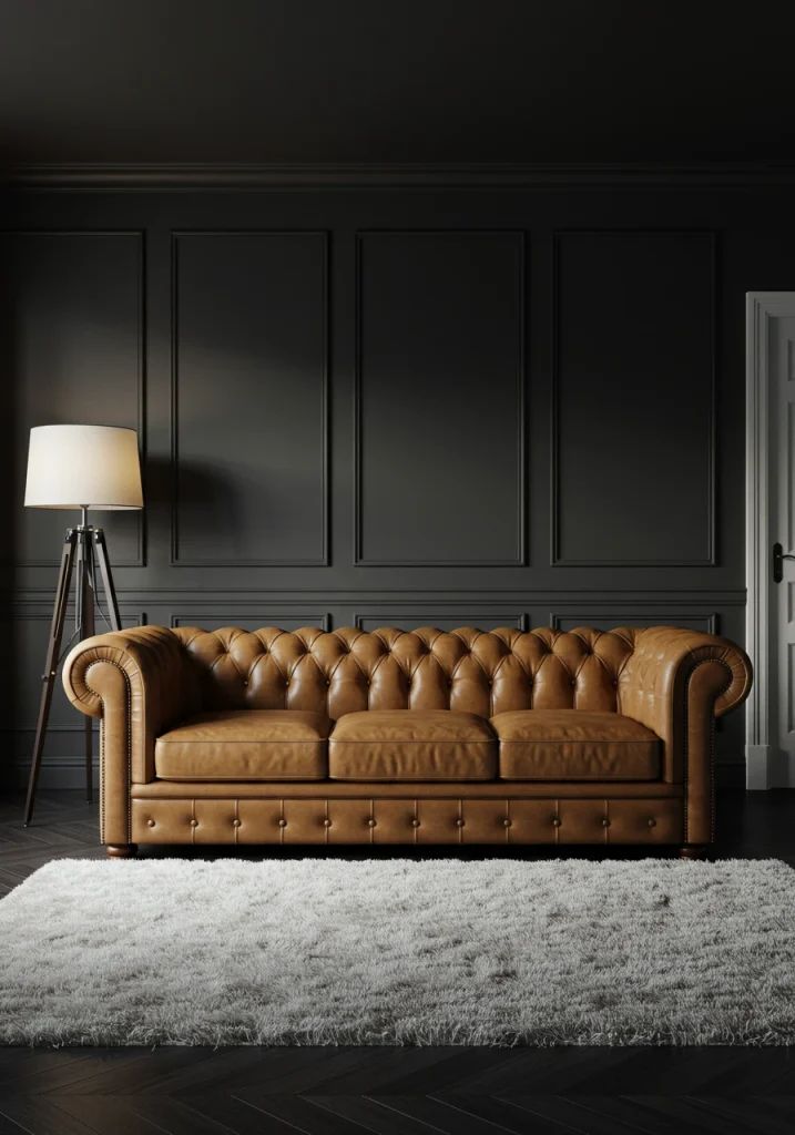
3. Charcoal, Cognac Leather, and White: The Moody & Masculine
For a look that is moody, sophisticated, and full of rich, textural contrast, this color combination is a guaranteed winner. The deep, dramatic charcoal gray on the walls creates a cozy, enveloping backdrop. The rich, warm, caramel-brown tone of a cognac leather sofa provides a stunning, organic contrast and a touch of rugged luxury. Finally, crisp white accents in the trim, ceiling, and accessories provide a necessary lift, keeping the dark palette from feeling too heavy.
This is my go-to palette for creating a chic, library-like, or “dark academia” vibe. It’s a space that feels perfect for evening conversations and relaxation. The key is to ensure you have enough white and warm light to balance the darkness of the walls.
- How to Apply: Use a deep charcoal gray (like Sherwin-Williams’ “Iron Ore”) on the walls. The main sofa should be a beautiful, cognac-colored leather. Use a light-colored, textured area rug (like a white or cream shag) and crisp, white trim.
- Mood: Moody, sophisticated, cozy, and masculine.
- Best For: Creating a dramatic and intimate den or a formal living room.
For an enhancement, bring in a deep, forest green through a few throw pillows or a lush, leafy plant. The green will beautifully complement the earthy tones of the leather and the charcoal gray.
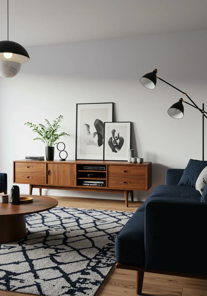
4. Navy Blue, White, and Walnut: The Classic Mid-Century
This color combination is a timeless classic that exudes a sense of confident, tailored style. Deep, saturated navy blue is a sophisticated and versatile color that can act as a bold statement or a classic neutral. When paired with the crisp, clean contrast of white and the rich, organic warmth of walnut wood, the result is a perfectly balanced and high-end look. This palette is a cornerstone of both classic, preppy design and mid-century modern aesthetics.
I love using this combination for a look that feels both formal and comfortable. The navy provides depth, the white provides brightness, and the walnut provides essential, natural warmth.
- How to Apply: Consider a bold, navy blue accent wall behind your sofa, or a statement navy sofa. Use white on the other walls and in textiles like pillows and throws. Incorporate walnut through a classic mid-century modern credenza, a coffee table, and the legs of your furniture.
- Mood: Classic, confident, sophisticated, and grounded.
- Best For: A living room with a mid-century modern, transitional, or classic traditional style.
For an enhancement, add a few metallic accents in a warm, brushed brass. The combination of navy blue, white, and brass is a truly timeless and luxurious designer-approved trio.
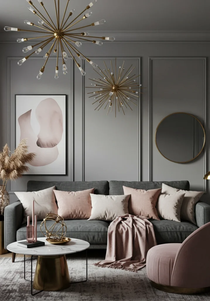
5. Blush Pink, Gray, and Brass: The Soft & Chic
For a look that is soft, feminine, and incredibly chic, pairing a dusty blush pink with a sophisticated gray is a beautiful and very current color combination. The cool neutrality of the gray provides the perfect, grounding balance for the gentle, warm sweetness of the blush pink. This is a palette that feels modern, romantic, and very serene, without being overly saccharine.
This is a favorite palette of mine for creating a space that feels both calm and glamorous. The key is to use the blush pink as a deliberate accent against a gray foundation. I recommend using a beautiful, soft, light-to-medium gray on the walls, and then bringing in the blush pink through a statement armchair, throw pillows, or a piece of abstract art. The final, essential ingredient is the warm, metallic glow of brass.
- How to Apply: Use a soft gray (like Farrow & Ball’s “Elephant’s Breath”) on the walls. Choose a gray sofa. Add accents of blush pink through textiles and art. Use brass for your lighting, a mirror frame, and the legs of your furniture.
- Mood: Soft, chic, romantic, and modern.
- Best For: Creating an elegant and feminine space that still feels grounded and sophisticated.
For an enhancement, introduce a touch of a deep, jewel-toned color, like an emerald green or a deep burgundy, in a single, small accent pillow. This will add a surprising and sophisticated layer of depth to the soft palette.
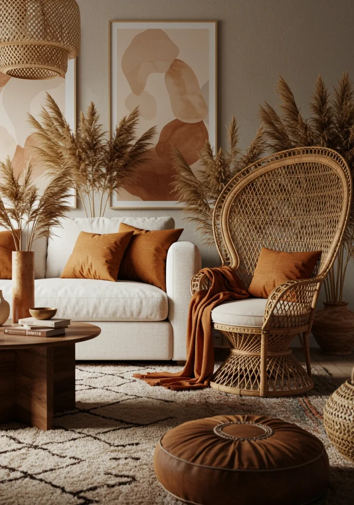
6. Terracotta, Cream, and Rattan: The Bohemian Earth
This color combination is warm, earthy, and full of natural, bohemian texture. Terracotta, with its warm, clay-like, reddish-brown tones, is an incredibly grounding and inviting color. When paired with the soft, simple brightness of a creamy off-white and the rustic, woven texture of natural rattan, the result is a palette that feels like a warm, sun-drenched desert escape.
This is the perfect palette for a relaxed, bohemian, or modern rustic living room. I love how it feels both ancient and completely contemporary at the same time. The key is to embrace the natural textures.
- How to Apply: Consider a terracotta-colored limewash for a stunning, textural accent wall. Use a comfortable sofa in a creamy white or beige fabric. Incorporate rattan through a statement accent chair, a light fixture, or a collection of woven baskets.
- Mood: Earthy, warm, relaxed, and bohemian.
- Best For: Creating a casual, textural, and globally-inspired living room.
For an enhancement, add plenty of desert-inspired plants. A tall, sculptural cactus or a collection of succulents in terracotta pots will perfectly complement this earthy and organic color scheme.
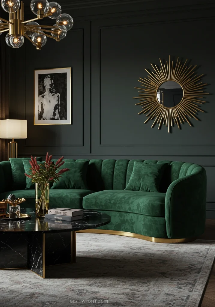
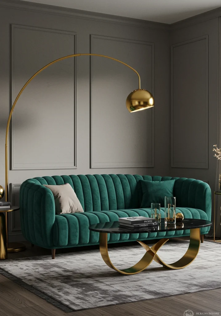
7. Emerald Green, Black, and Gold: The Art Deco Glamour
For a look that is unapologetically bold, dramatic, and luxurious, this jewel-toned color combination is a showstopper. Rich, deep emerald green is a color of opulence and sophistication. When paired with the sharp, graphic contrast of black and the warm, glamorous gleam of gold or brass, the result is a palette that is reminiscent of the glamorous Art Deco era.
This is a palette for making a statement. I love using this combination in a formal living room or a space designed for evening entertaining. A deep, emerald green velvet sofa against a black accent wall is the height of drama. The gold accents are essential for adding light and a necessary touch of sparkle to the dark, rich palette.
- How to Apply: Use emerald green as your main statement color, either on the walls or on a large sofa. Use black in smaller but significant doses—a coffee table, picture frames, an accent chair. Sprinkle gold or brass accents throughout in your lighting, hardware, and decorative objects.
- Mood: Luxurious, dramatic, glamorous, and sophisticated.
- Best For: An Art Deco, Hollywood Regency, or modern maximalist style living room.
For an enhancement, incorporate a piece of furniture with a high-gloss, black lacquer finish. The deep, reflective surface will add another layer of sleek, Art Deco-inspired glamour to the room.
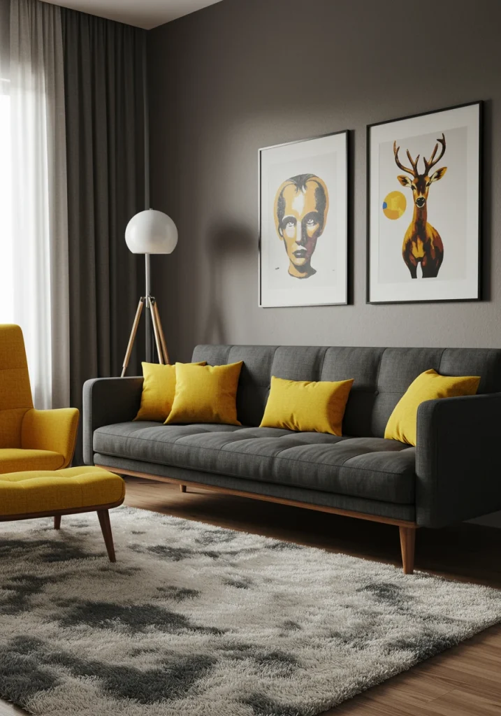
8. Mustard Yellow, Charcoal, and White: The Mid-Century Pop
This color combination is a perfect blend of moody sophistication and optimistic, retro energy. Deep charcoal gray provides a stable, grounding, and modern foundation. Crisp white adds a necessary, clean, graphic contrast. And a vibrant, mustard or ochre yellow adds a powerful, warm, and cheerful pop of color that is a hallmark of the mid-century modern aesthetic.
This is a wonderfully balanced palette that feels both cool and warm at the same time. I love to use charcoal gray as the main color for a large piece, like a sofa, and then bring in the mustard yellow as a statement accent chair or in a bold, geometric-patterned rug.
- How to Apply: Use charcoal gray for your main sofa or an accent wall. Use white for your other walls and trim. Add mustard yellow through an accent chair, throw pillows, curtains, or a piece of abstract art.
- Mood: Energetic, stylish, retro, and confident.
- Best For: A mid-century modern or a contemporary, eclectic living room.
For an enhancement, be sure to incorporate plenty of warm, mid-toned wood, like teak or walnut, in your furniture. The warm wood tones are the perfect bridge between the cool charcoal and the warm yellow.
9. Greige, Cream, and Charcoal: The Sophisticated Neutral
This is a beautiful, tonal, and incredibly sophisticated neutral color palette. It takes the idea of a simple gray or beige room and elevates it by layering a full spectrum of warm, gray-beige tones. “Greige”—that perfect blend of gray and beige—serves as the main, mid-tone foundation. A soft, creamy white is used for brightness and contrast, and a deep, rich charcoal or a near-black is used in small doses to add depth and a grounding, graphic element.
This is a go-to palette for me when a client wants a space that is serene, timeless, and has a quiet, luxurious feel. The beauty is in the subtle interplay between the different tones.
- How to Apply: Use a warm greige on the walls. Choose a sofa in a slightly lighter, creamy off-white. Use a rug that has a pattern incorporating all three tones. Add your sharpest contrast with a few, small charcoal accents, like a throw pillow, a picture frame, or a vase.
- Mood: Serene, sophisticated, timeless, and calm.
- Best For: A transitional, modern classic, or warm minimalist living room.
For an enhancement, focus heavily on texture. Since the color palette is so subtle, a rich mix of textures—a nubby boucle, a soft linen, a smooth leather, a rough-hewn wood—is essential to keep the room from feeling flat.
alt text: A sophisticated, neutral living room with a color combination of greige, cream, and charcoal.
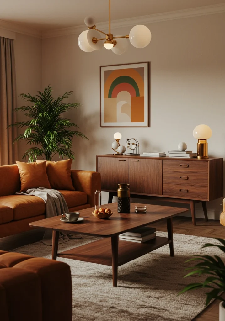
10. Burnt Orange, Cream, and Dark Wood: The Autumnal Warmth
For a living room that feels incredibly warm, cozy, and inviting, this earthy and autumnal color palette is a perfect choice. Rich, deep, burnt orange is a color that is both energetic and grounding. When paired with the soft, calming brightness of a creamy white and the deep, rich tones of a dark wood like walnut or ebony, the result is a palette that feels like a warm, cozy hug on a crisp autumn day.
I love this palette for a living room with a rustic, mid-century, or traditional feel. The burnt orange can be used on a statement piece like a velvet sofa or a pair of armchairs to create a powerful, warm focal point.
- How to Apply: Use a creamy white on the walls to keep the space bright. Bring in the burnt orange through your main upholstery or a large, patterned area rug. Use dark wood for your coffee table, media console, and the legs of your furniture.
- Mood: Warm, cozy, inviting, and earthy.
- Best For: Creating a warm, autumnal, or 70s-inspired retro vibe.
For an enhancement, add a few accents of a deep, olive or forest green. Green is a natural complement to orange and will add another layer of earthy, organic richness to the palette.
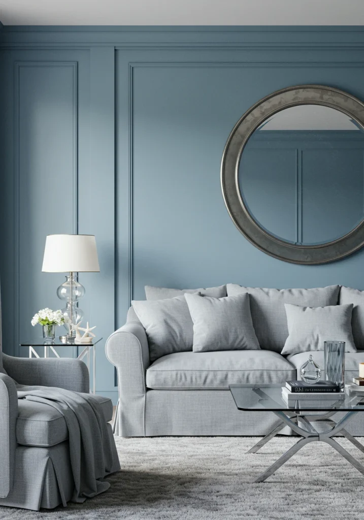
11. Dusty Blue, Gray, and Silver: The Coastal Serenity
This color combination is perfect for creating a living room that feels calm, serene, and has a touch of a breezy, coastal elegance. A soft, dusty blue is a very calming and easy-to-live-with color. When paired with a light, silvery-gray and the cool, reflective sheen of silver or polished chrome accents, the result is a palette that is cool, airy, and very sophisticated.
This is a wonderful alternative to a beige or all-gray neutral scheme. I often use a very pale, dusty blue on the walls, as it can almost act as a neutral, and then layer in a comfortable, gray sofa and other gray tones. The key is the metallic accent; the cool shine of silver, nickel, or chrome is what gives this palette its crisp, polished feel.
- How to Apply: Use a dusty blue on the walls or in a patterned rug. A gray sofa is a perfect, versatile anchor. Use silver or chrome for your lighting, mirror frames, and coffee table base.
- Mood: Calm, serene, airy, and coastal.
- Best For: A coastal, traditional, or transitional style living room.
For an enhancement, incorporate a few accents of a sandy beige color through woven baskets or a jute rug. This will add a touch of warmth and a natural, beachy texture to the otherwise cool palette.
12. Deep Teal, Gray, and Gold: The Modern Glamour
For a look that is both moody and glamorous, the combination of a deep, rich teal with a sophisticated gray and the warm sparkle of gold is a stunning choice. Teal is a complex and beautiful color, a perfect blend of blue and green, that can feel both calming and energetic. When used as a statement color against a backdrop of neutral gray, it feels incredibly chic and luxurious. The addition of gold is the essential finishing touch that provides warmth and glamour.
I love this palette for creating a space that feels dramatic and special. A deep, teal velvet sofa against a medium-gray wall is a showstopper. This combination is a favorite in boutique hotels and high-end residential design.
- How to Apply: Use a medium gray on the walls. Invest in a statement piece in a deep teal, like a sofa or a pair of armchairs. Sprinkle gold accents throughout the room in your lighting, a mirror, and decorative objects.
- Mood: Glamorous, sophisticated, dramatic, and luxurious.
- Best For: A modern, art deco, or contemporary glam living room.
For an enhancement, add a few, small accents of a contrasting, warm color, like a deep coral or a blush pink, in a throw pillow or a piece of art. This will add another layer of complexity and visual interest to your palette.
13. Light Gray, White, and Black: The Scandinavian Classic
This is the quintessential color combination for a classic, modern, Scandinavian-inspired living room. It’s a study in simplicity, contrast, and light. The foundation is a very light and airy palette of light gray and crisp white, which maximizes natural light and creates a feeling of calm and spaciousness. The power of this palette comes from the addition of sharp, graphic, black accents. The black provides a necessary point of contrast that grounds the light colors and adds a modern, graphic edge.
This is a timeless and foolproof combination. As a designer, I rely on this palette to create spaces that feel both serene and visually interesting.
- How to Apply: Use a very light gray or a crisp white on the walls. Choose a sofa in a light to medium gray. Your black accents are key: use a thin, black metal frame for your coffee table and side tables, use simple black frames for your art, and choose a black floor lamp.
- Mood: Minimalist, calm, airy, and graphic.
- Best For: A Scandinavian, minimalist, or modern industrial living room.
For an enhancement that is classic to this style, introduce plenty of light, natural wood tones (like a light oak or a birch) in your furniture or flooring, and add a few, green house plants. This will add the essential layer of natural warmth that keeps the space from feeling too sterile.
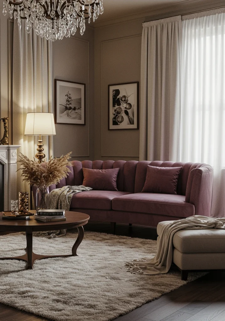
14. Deep Plum, Greige, and Cream: The Understated Elegance
For a color palette that is unique, sophisticated, and has a touch of moody romance, the combination of a deep, dusty plum with a warm greige and a soft cream is a beautiful and unexpected choice. Deep plum is a rich, complex color that feels luxurious and cozy without being as dark as a charcoal or a navy. When paired with the gentle, earthy warmth of greige and the soft brightness of cream, the result is a palette that is elegant, inviting, and very chic.
This is a great palette for someone who loves color but wants a more subdued and sophisticated look. I love to use the deep plum on a statement piece, like a velvet sofa or a feature wall, and then wrap the rest of the room in the soft, warm neutrals.
- How to Apply: Use a warm greige on the walls. A statement sofa in a deep, dusty plum velvet would be stunning. Layer in plenty of soft, creamy white tones in your rug, your pillows, and your curtains to keep the look light.
- Mood: Elegant, sophisticated, romantic, and cozy.
- Best For: A traditional, transitional, or eclectic living room.
For an enhancement, add a few accents of a muted, antique gold. The soft, aged glow of the gold will beautifully complement the rich, warm tones of the plum and the greige.
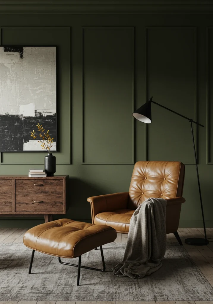
15. Olive Green, Tan Leather, and Black: The Organic & Modern
This color combination is earthy, textural, and has a sophisticated, organic, and slightly masculine feel. Deep, olive green is a rich, complex neutral that is deeply connected to nature. When paired with the warm, rugged, and timeless texture of a tan or cognac-colored leather and the sharp, graphic edge of black accents, the result is a palette that is grounded, comfortable, and effortlessly cool.
This is a personal favorite palette of mine for its rich, layered, and natural feel. It’s perfect for a modern rustic, an industrial, or a mid-century modern aesthetic.
- How to Apply: Use the olive green on the walls or as the color for a fabric sofa. The key accent piece is a classic armchair in a warm, tan leather. Use black in your metal accents, like lighting and picture frames, and perhaps in your coffee table.
- Mood: Earthy, organic, sophisticated, and relaxed.
- Best For: A modern rustic, industrial, or mid-century modern living room.
For an enhancement, incorporate a lot of living, green plants. The vibrant green of the houseplants will add another layer of natural color and will harmonize beautifully with the deep, olive green tones in the room.
Conclusion
Choosing the right living room color combination is the most powerful step you can take to create a space that truly feels like home. As we’ve explored through these 15 inspiring ideas, a successful color palette is about more than just paint; it’s a harmonious blend of colors, textures, and finishes that work together to create a specific mood. Whether you’re drawn to the calm serenity of warm neutrals, the earthy comfort of greens and terracottas, or the bold drama of jewel tones, there is a perfect combination for every style and every home.