Are you searching for the best living room paint colors to create a space that perfectly reflects your personal style? A can of paint is the single most powerful and affordable tool in any designer’s toolkit. The right color on your walls can completely transform the mood of your living room, making it feel cozier, brighter, more dramatic, or more serene.
But with thousands of shades to choose from, selecting the perfect one can feel overwhelming. The key is to find a color that not only looks beautiful but also serves as a versatile backdrop for your furniture, art, and life.
This guide is your curated list of the 15 best, most versatile, and designer-approved paint colors for any living room style. From the perfect airy whites and sophisticated neutrals to rich, moody hues, these shades will provide the perfect canvas for a stunning and stylish home.
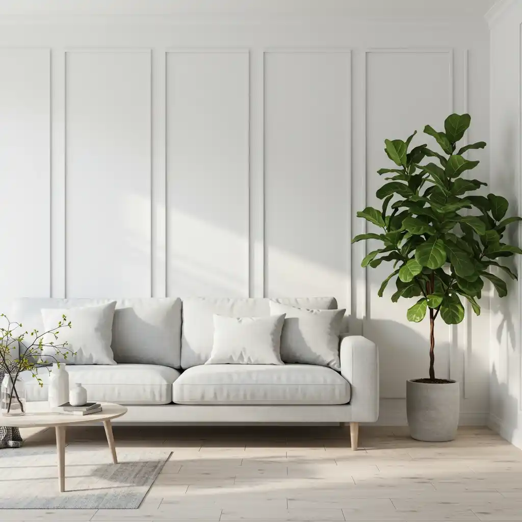
1. Crisp, Clean White: The Ultimate Blank Canvas
A crisp, clean white is the ultimate blank canvas. It’s a timeless, versatile, and light-reflecting choice that can make any living room feel larger, brighter, and more open. A pure white with a neutral or very slightly cool undertone is perfect for modern, minimalist, and Scandinavian-inspired spaces. It creates a clean, gallery-like backdrop that allows your furniture, art, and architectural details to be the stars of the show.
I use this color when clients want a fresh, uncluttered, and airy feel. The key to a successful white living room is to add plenty of texture to keep it from feeling sterile. Think of a chunky knit blanket, a natural fiber rug, warm wood tones, and lots of green plants.
- Best For: Modern, Minimalist, Scandinavian, and Coastal styles.
- Mood: Bright, airy, clean, and spacious.
- Designer Favorites: Benjamin Moore “Chantilly Lace” (a very pure white), Sherwin-Williams “Extra White” (a crisp, bright white).
For a high-end enhancement, paint your walls, trim, and ceiling all in the same shade of crisp white, but use a different finish for each. For example, a matte finish on the walls, a satin finish on the trim, and a flat finish on the ceiling. This creates a subtle, sophisticated, and seamless look.
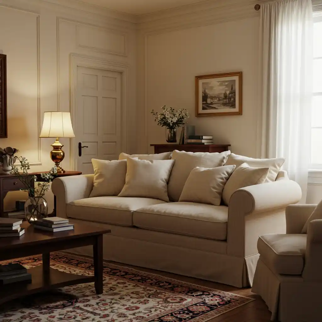
2. Warm, Creamy White: The Soft and Inviting Neutral
If a stark, pure white feels too cold or clinical for you, a warm, creamy off-white is the perfect alternative. These whites have a soft, subtle, yellow or beige undertone that gives them a warm, inviting, and luminous quality. A creamy white is incredibly versatile and creates a soft, gentle backdrop that feels cozier and more traditional than a pure white. It pairs beautifully with natural wood tones, antique furniture, and warm metallic accents like brass.
This is my go-to choice for creating a living room that feels both bright and deeply comfortable. As the color experts at Farrow & Ball often note, these soft whites have a timeless quality that feels at home in almost any style, from traditional to modern farmhouse.
- Best For: Traditional, Modern Farmhouse, and Transitional styles.
- Mood: Warm, inviting, soft, and timeless.
- Designer Favorites: Benjamin Moore “White Dove” (a soft, beloved white), Farrow & Ball “Wimborne White” (a classic, warm off-white).
For a rich, layered enhancement, use a creamy white on your walls and then paint your trim and doors in a slightly deeper, coordinating warm beige or taupe. This tone-on-tone look is very sophisticated and adds a subtle architectural depth to the room.
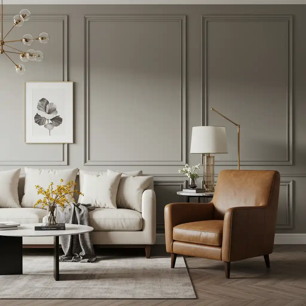
3. The Perfect “Greige”: The Ultimate Versatile Neutral
For the homeowner who can’t decide between gray and beige, “greige” is the perfect, chameleon-like solution. Greige is a beautiful, sophisticated color that is a perfect blend of warm beige and cool gray. It has the modern, chic quality of gray but with the warmth and inviting nature of beige, making it perhaps the most versatile and popular neutral for a living room.
Greige is a fantastic foundation because it works with almost any other color or material. It pairs just as beautifully with cool, silver accents as it does with warm, brass and wood tones. I often use a mid-toned greige to create a calm, sophisticated, and incredibly flexible backdrop for my clients.
- Best For: Any style, but particularly Transitional, Contemporary, and Modern Farmhouse.
- Mood: Balanced, sophisticated, calm, and incredibly versatile.
- Designer Favorites: Benjamin Moore “Revere Pewter” (the iconic, perfect greige), Sherwin-Williams “Agreeable Gray” (a slightly lighter, very popular choice).
For an enhancement, pair greige walls with crisp, white trim to make the color pop, and then layer in a variety of other neutral textures, like a cream-colored boucle chair, a taupe linen sofa, and a natural jute rug for a rich, tonal look.
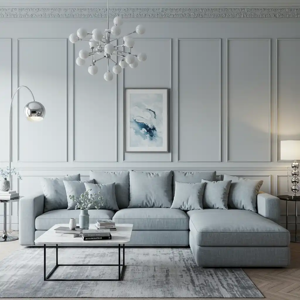
4. Soft, Light Gray: The Serene and Modern Choice
A soft, light gray is a chic and modern alternative to white or beige. It has a calming, serene, and sophisticated quality that can make a living room feel both restful and elegant. A light gray with a cool, slightly blue or purple undertone will feel very crisp, airy, and modern. A light gray with a warmer, slightly green or beige undertone will feel a bit softer and more organic.
This is a favorite color of mine for creating a peaceful and elegant retreat. Light gray is incredibly versatile and pairs beautifully with a huge range of accent colors, from soft blush pinks to bold navy blues. It also looks fantastic with a wide variety of wood tones and metal finishes.
- Best For: Modern, Contemporary, Transitional, and Minimalist styles.
- Mood: Serene, calming, sophisticated, and airy.
- Designer Favorites: Benjamin Moore “Gray Owl” (a very versatile light gray), Farrow & Ball “Elephant’s Breath” (a beautiful, warm gray).
For a chic, monochromatic enhancement, use a light gray on the walls and then choose a sofa that is a few shades darker, in a medium-to-charcoal gray. This layered, tone-on-tone look is very sophisticated and allows the textures in the room to really stand out.
5. Deep, Moody Charcoal Gray: The Dramatic and Cozy Choice
For a look that is bold, dramatic, and incredibly cozy, embrace a deep, dark charcoal gray. This is a sophisticated and moody choice that can make a living room feel like an intimate, enveloping cocoon. A deep charcoal is less harsh than a pure black and often has a subtle, complex undertone (like blue or brown) that gives it a lot of depth. It’s a perfect backdrop for making art, metallic accents, and rich colors pop.
I love using charcoal gray in a living room that is primarily used in the evenings, as it creates a wonderfully intimate and relaxing atmosphere. The key is to balance the dark walls with plenty of warm, layered lighting and a few lighter-colored elements, like a cream sofa or a light-colored rug, to keep the space from feeling too dark.
- Best For: Modern, Industrial, and Traditional styles (for a dramatic library feel).
- Mood: Dramatic, cozy, intimate, and sophisticated.
- Designer Favorites: Benjamin Moore “Kendall Charcoal,” Sherwin-Williams “Iron Ore.”
For a very high-end enhancement, choose a charcoal gray paint that has a very flat, matte, or even a chalky finish. This will make the walls look incredibly velvety and will absorb the light in a beautiful, soft way, enhancing the moody, cocoon-like feeling.
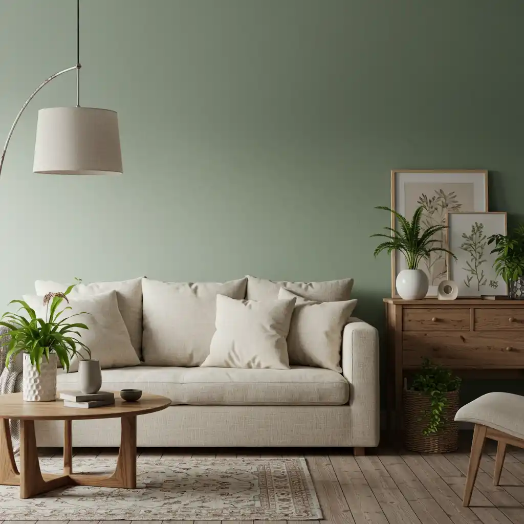
6. Earthy Sage Green: The Calming and Natural Hue
Green is the color of nature, and bringing it into your living room can create a space that feels incredibly calming, grounding, and restorative. A soft, earthy, sage green is a particularly beautiful and versatile choice. It’s a gray-green that has a wonderfully muted, soft quality, so it acts almost like a neutral while still providing a touch of gentle color.
This is one of my favorite colors for creating a serene and organic-feeling space. As the color experts at Behr often highlight, nature-inspired greens are known to reduce stress and create a sense of well-being. Sage green pairs beautifully with natural materials like wood, rattan, and linen, as well as with creamy whites and warm, brassy metals.
- Best For: Organic Modern, Modern Farmhouse, and Bohemian styles.
- Mood: Calming, grounding, natural, and serene.
- Designer Favorites: Farrow & Ball “Mizzle,” Sherwin-Williams “Sea Salt” (a very light, airy gray-green).
For an enhancement, lean into the biophilic design trend. In your sage green room, add an abundance of real, living houseplants. The combination of the green on the walls and the living greenery will create a truly immersive, calming, and nature-inspired oasis.
7. Rich, Deep Forest Green: The Traditional and Enveloping Choice
For a bolder, more dramatic, and historic take on green, a rich, deep forest or emerald green is a stunning choice. This is a color that evokes the feeling of a classic, English library or a cozy, traditional study. It’s a color that is deeply saturated and incredibly enveloping, perfect for creating a moody, sophisticated, and timeless living room.
I love to use a deep green in a room that has beautiful, traditional architectural details, as the dark color can really make the white trim and molding pop. It pairs beautifully with rich, dark wood tones, warm leather, and classic, brass accents. This is a confident and luxurious color choice.
- Best For: Traditional, Eclectic, and Art Deco styles.
- Mood: Cozy, traditional, scholarly, and luxurious.
- Designer Favorites: Benjamin Moore “Salamander,” Farrow & Ball “Green Smoke.”
For a truly luxurious enhancement, pair your deep green walls with a statement sofa upholstered in a rich, jewel-toned velvet, like a deep sapphire blue or a warm, golden ochre. The combination of the deep, saturated colors is incredibly opulent and chic.

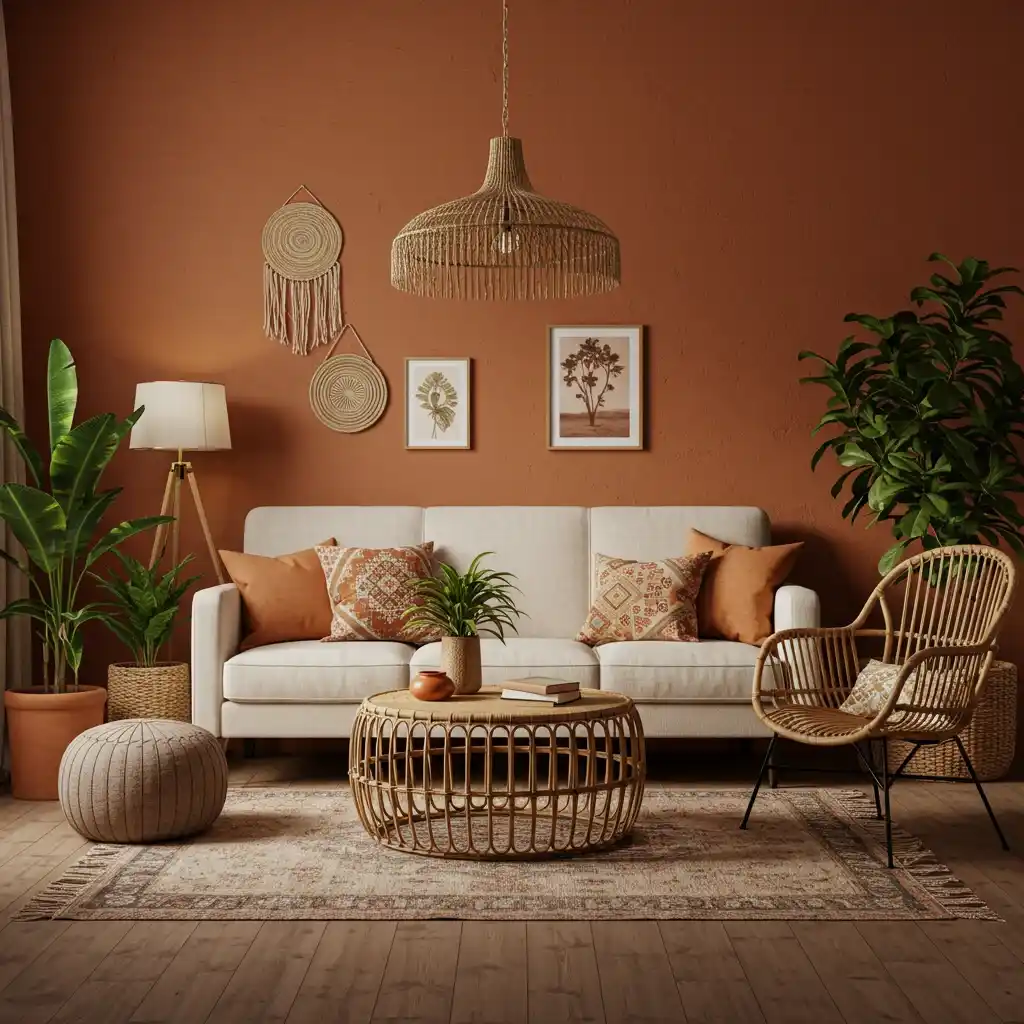
8. Warm, Terracotta Clay: The Earthy and Bohemian Hue
For a look that is warm, earthy, and full of global, bohemian charm, a warm, terracotta clay color is a fantastic choice. This is a beautiful, muted, earthy orange-pink that is reminiscent of sun-baked earth, desert landscapes, and handmade pottery. It’s a color that is incredibly warm and inviting, and it can make a living room feel very cozy and grounded.
This is a favorite color in the world of organic modern and modern bohemian design. I love how it instantly adds a layer of warmth and a touch of the exotic to a space. It pairs beautifully with a huge range of natural materials, including light woods, rattan, jute, and linen, as well as with a lot of green from houseplants.
- Best For: Bohemian, Southwestern, and Organic Modern styles.
- Mood: Warm, earthy, inviting, and creative.
- Designer Favorites: Sherwin-Williams “Cavern Clay,” Farrow & Ball “Red Earth.”
For an enhancement, choose a paint with a very matte, almost chalky or plaster-like finish, like a limewash paint. This will give your terracotta walls a beautiful, soft, textural quality that enhances the earthy, handmade feel of the color.
9. Serene, Pale Blue: The Airy and Coastal Vibe
A soft, pale blue is a wonderfully serene and calming color for a living room. It’s a color that evokes the feeling of a clear sky or a calm sea, and it can make a room feel very airy, open, and tranquil. A pale blue with a hint of gray in it is a particularly sophisticated and versatile choice that can act as a beautiful, colored neutral.
This is a go-to color for me when I want to create a space that feels calm and restful, and it’s a natural fit for a coastal or a traditional design aesthetic. It pairs beautifully with crisp whites, sandy beiges, and natural, light wood tones. As color psychology suggests, blue is a color that promotes peace and tranquility.
- Best For: Coastal, Traditional, and Transitional styles.
- Mood: Calming, serene, airy, and peaceful.
- Designer Favorites: Sherwin-Williams “Upward,” Farrow & Ball “Parma Gray” (which is actually a beautiful, soft blue).
For an enhancement that completes the coastal feel, pair your pale blue walls with slipcovered furniture in a crisp, white cotton or linen. The combination is timeless, breezy, and effortlessly chic.

10. Sophisticated, Deep Navy Blue: The Bold and Classic Choice
For a look that is bold, classic, and incredibly sophisticated, a deep navy blue is a stunning choice for a living room. Navy is a timeless and versatile color that acts almost like a neutral, pairing beautifully with a huge range of other colors and materials. A room with navy blue walls feels confident, cozy, and has a slightly nautical, yet very elegant, feel.
I love to use navy as a dramatic and enveloping backdrop. It’s a fantastic alternative to charcoal gray for a moody look, as it has a bit more color and life to it. It looks particularly stunning when paired with crisp white trim, warm leather, and rich, brass metallic accents.
- Best For: Traditional, Preppy, Coastal, and Modern Glam styles.
- Mood: Sophisticated, classic, confident, and cozy.
- Designer Favorites: Benjamin Moore “Hale Navy,” Sherwin-Williams “Naval.”
For a high-end, designer enhancement, choose a high-gloss or lacquer finish for your navy blue walls. The reflective, shiny surface is an incredibly glamorous and dramatic statement, especially in a formal living room or a study. It’s a look frequently seen in the pages of Architectural Digest.

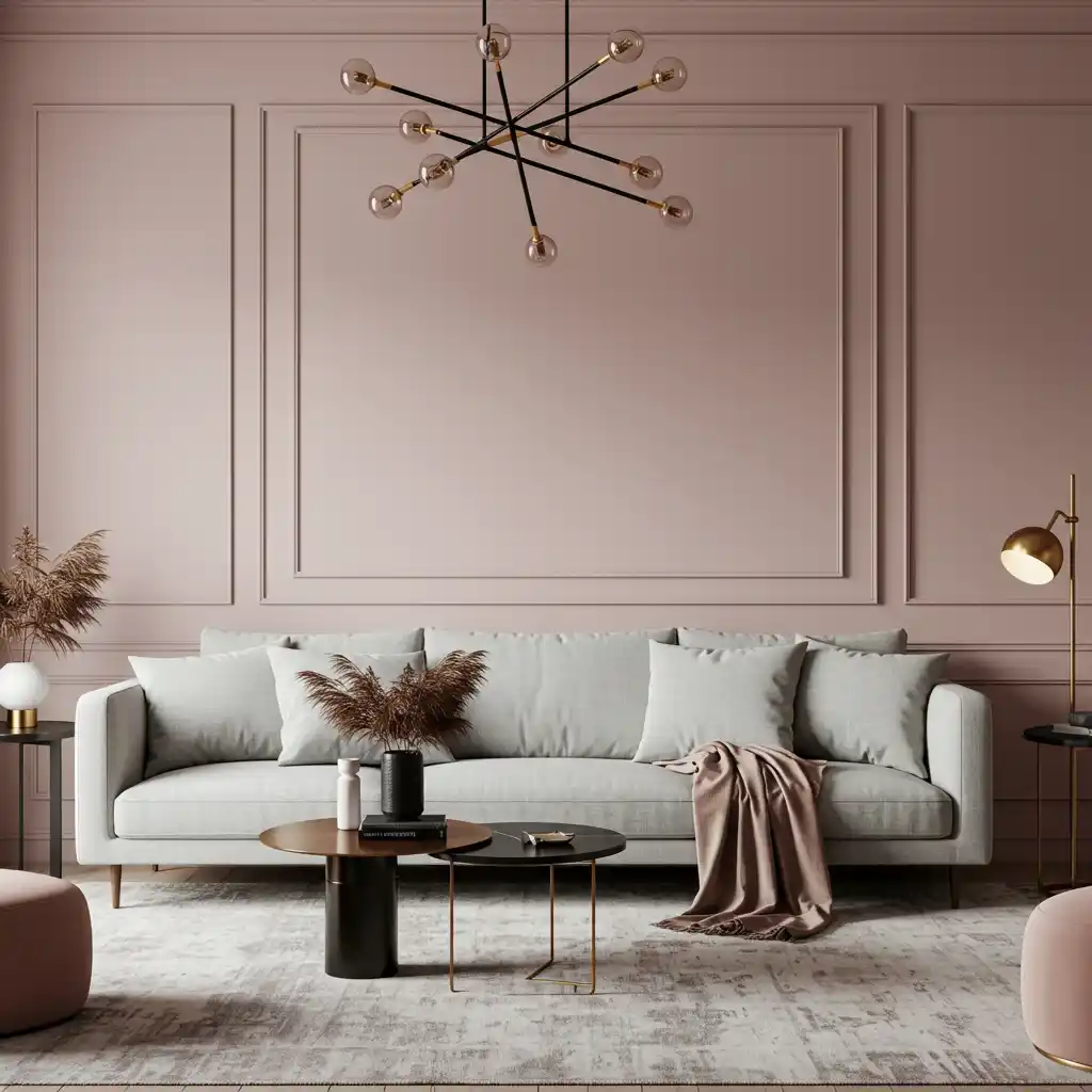
11. Soft, Muted Blush Pink: The New Neutral
Blush pink has shed its nursery-only reputation and has become a sophisticated and surprisingly versatile “new neutral” in the world of interior design. A soft, muted, dusty blush with a grayish or beige undertone is a wonderfully warm and inviting color that can make a living room feel incredibly chic, gentle, and calming.
This is a color that I love to use to create a space that feels warm and has a soft, flattering glow. It’s a wonderful alternative to beige or cream. It pairs beautifully with other neutrals like gray and cream, and it looks absolutely stunning with warm, brass accents and light, natural wood tones.
- Best For: Modern, Scandinavian, and Art Deco-inspired styles.
- Mood: Chic, warm, gentle, and sophisticated.
- Designer Favorites: Farrow & Ball “Setting Plaster,” Benjamin Moore “First Light.”
For an enhancement that balances the feminine quality of the pink, incorporate a few, strong, black accents. A black metal floor lamp, a simple black picture frame, or a black marble coffee table can add a graphic, modern edge that keeps the blush from feeling overly sweet.
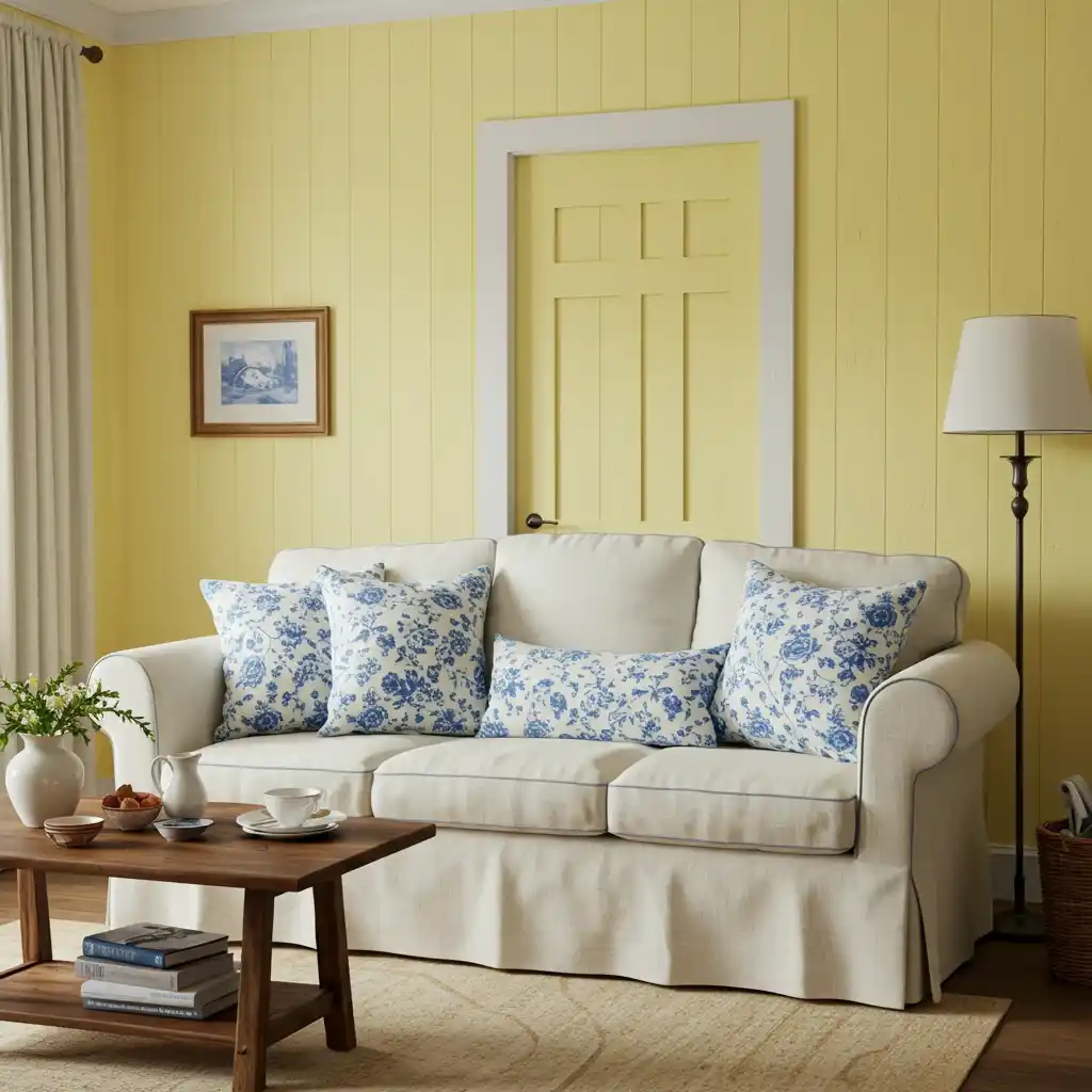
12. Cheerful, Buttery Yellow: The Optimistic Choice
For a living room that feels cheerful, sunny, and full of optimistic energy, a soft, buttery yellow is a beautiful and welcoming choice. A pale, creamy yellow can act as a warm and inviting neutral, while a slightly more saturated, but still soft, yellow can make a room feel like it’s filled with sunshine, even on a cloudy day.
This is a wonderful color for a family living room, as it promotes a sense of happiness and energy. I always advise my clients to choose a yellow that is soft and has a bit of a creamy or beige undertone, rather than a bright, primary yellow, which can be a bit overwhelming on all four walls.
- Best For: Cottage, Farmhouse, and Traditional styles.
- Mood: Cheerful, sunny, happy, and welcoming.
- Designer Favorites: Look for soft, buttery, or creamy yellows, not neon or lemon yellows.
For a classic and timeless enhancement, pair your soft, yellow walls with accents of a crisp, classic blue and white. A blue and white patterned rug or a few blue and white ginger jars will create a beautiful, French country-inspired look.
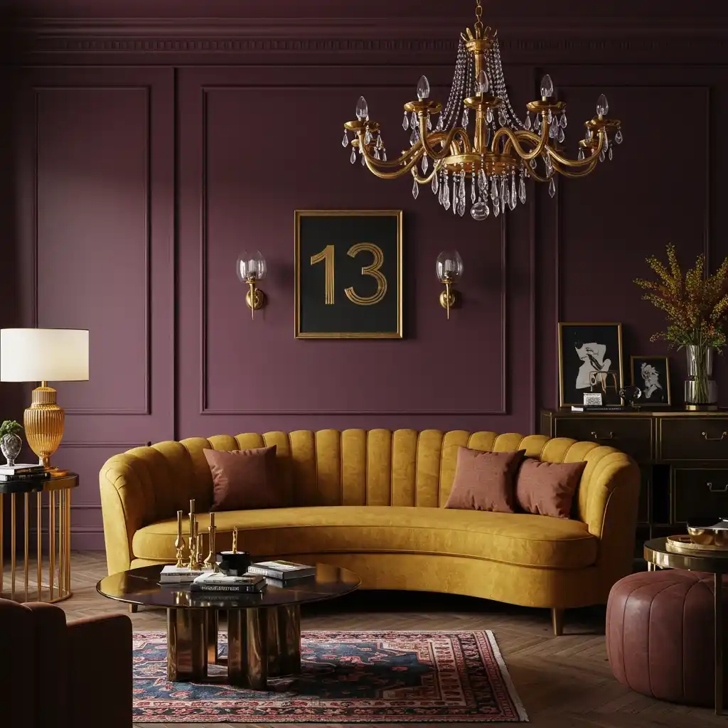
13. Rich, Jewel-Toned Plum: The Bold and Luxurious Hue
For a look that is deeply luxurious, unique, and full of romantic drama, a rich, jewel-toned plum or aubergine is a stunning and unexpected choice. This deep, purple-red is a very bold and confident color that can create an incredibly cozy, warm, and opulent atmosphere. It’s a fantastic color for a formal living room or a space that is primarily used in the evenings.
This is a color that I love to use for a client who wants a truly one-of-a-kind and memorable space. Because it’s such a strong color, it creates a perfect backdrop for rich, warm textures and materials. It pairs absolutely beautifully with warm, golden-toned velvets, dark, rich woods, and, especially, with gleaming, brushed brass accents.
- Best For: Eclectic, Maximalist, and Art Deco styles.
- Mood: Luxurious, dramatic, romantic, and opulent.
- Designer Favorites: Look for deep, complex purples with a warm, reddish undertone.
For the ultimate enhancement, layer in a lot of rich, textural fabrics. A deep plum room is the perfect setting for a plush, velvet sofa, heavy, silk or velvet curtains, and a deep, patterned, vintage Persian rug.
14. Cozy, Warm Taupe: The Earthy and Grounding Neutral
A warm, rich taupe is a beautiful and deeply comforting neutral that is a fantastic alternative to gray or beige. Taupe is a complex color that sits somewhere between brown and gray, and it has a wonderful, earthy, and grounding quality. It’s a color that can make a living room feel incredibly cozy, stable, and serene.
I often use taupe to create a very sophisticated and layered, monochromatic, neutral space. It is a fantastic backdrop that works well with a huge variety of other colors and materials, from creamy whites and soft blacks to natural wood tones and stone.
- Best For: Transitional, Organic Modern, and Minimalist styles.
- Mood: Grounding, cozy, serene, and sophisticated.
- Designer Favorites: Look for a true, balanced taupe that doesn’t lean too purple or too green.
For an elegant and modern enhancement, pair your warm, taupe walls with a few, sharp, black accents. A black metal floor lamp or a coffee table with a black frame will provide a beautiful, graphic contrast that makes the warm, earthy quality of the taupe feel very contemporary and chic.

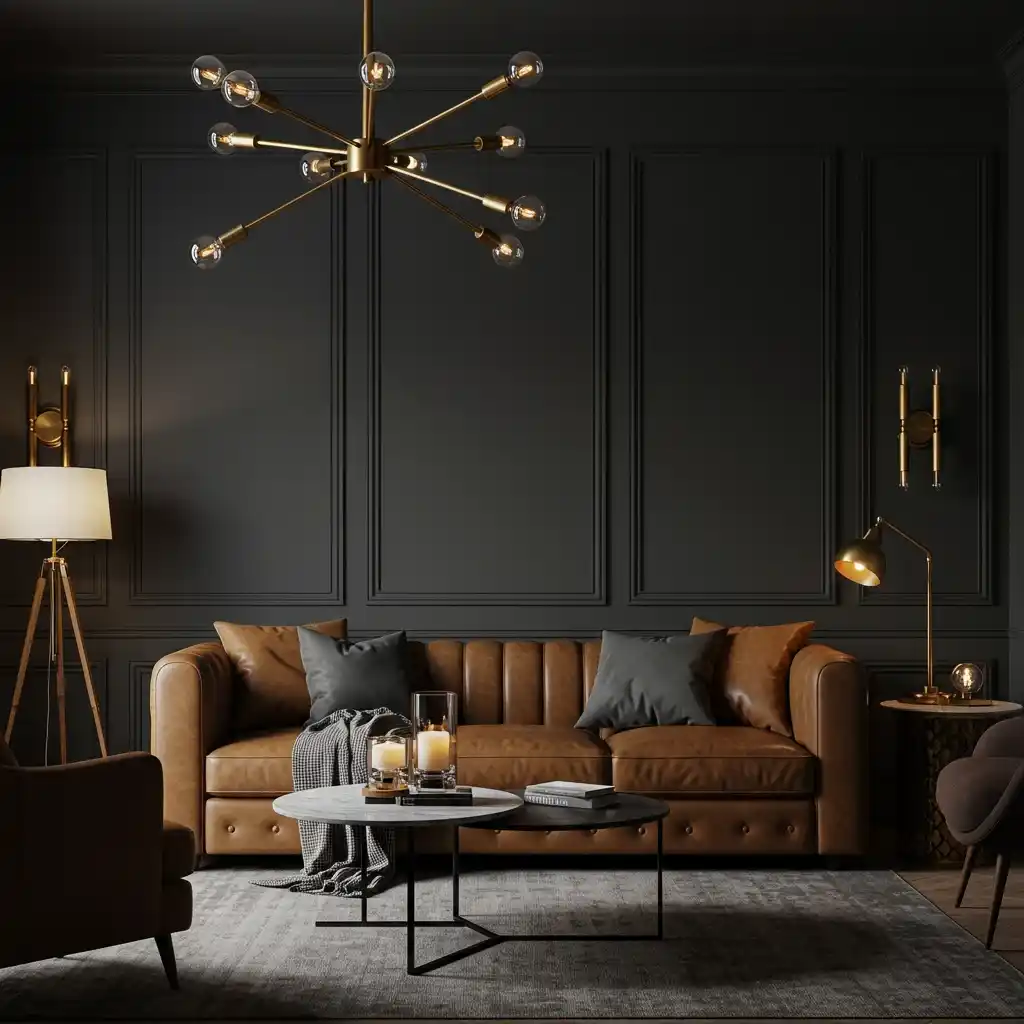
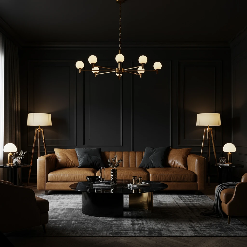
15. Dramatic, Inky Black: The Ultimate Bold Statement
For the ultimate in drama, sophistication, and cozy intimacy, painting a living room black is the boldest and most confident design choice you can make. A room with black walls is incredibly dramatic and enveloping. It’s a choice that is not for the faint of heart, but the result is a space that is unforgettable, chic, and surprisingly cozy, especially in the evening.
The key to a successful black room is, without a doubt, a great lighting plan and plenty of contrasting elements. I always ensure a black room has a lot of layered, warm lighting, a few, key pieces of light-colored furniture, and a number of reflective surfaces, like a large mirror and metallic accents, to bounce light around.
- Best For: Modern, Industrial, and Glamorous styles.
- Mood: Dramatic, intimate, confident, and sophisticated.
- Paint Finish: A very flat, matte finish is essential to get that soft, velvety, light-absorbing look.
For an enhancement that is absolutely stunning, pair your black walls with a sofa in a rich, warm, and deeply saturated color, like a caramel-colored leather or a deep, emerald green velvet. The contrast of the rich color and texture against the deep, black backdrop is the epitome of high-end, dramatic design.
Conclusion
Choosing the perfect paint color is the most transformative decision you can make for your living room. As we’ve explored through these 15 best living room paint colors, the right shade can set the mood, define your style, and create a beautiful, cohesive backdrop for your life. From the airy versatility of a soft, pale gray to the dramatic, cozy embrace of a deep forest green, there is a perfect color out there for every style and every home. The key is to consider the mood you want to create, the amount of natural light you have, and the colors in your existing furniture and decor.
Frequently Asked Questions (FAQs)
What is the most popular and timeless living room paint color?
Versatile, warm off-whites (like Benjamin Moore’s “White Dove”) and sophisticated, warm grays or “greiges” (like Benjamin Moore’s “Revere Pewter”) are consistently the most popular and timeless choices among designers and homeowners because they are incredibly versatile and create a warm, inviting backdrop for any style.
What paint color makes a living room look bigger and brighter?
A crisp, clean white (like Benjamin Moore’s “Chantilly Lace”) is the most effective color for making a room feel larger and brighter, as it reflects the most light. Soft, pale grays and very pale, cool blues can also create a very airy and spacious feel.
Should my living room be light or dark?
This depends entirely on the mood you want to create and how you use the space. A light color will feel airy, open, and energetic, which is great for a busy, daytime family hub. A dark color will feel more intimate, cozy, and dramatic, which is wonderful for a living room that is primarily used for relaxing in the evenings.
How do I choose the right paint color?
Always, always test samples! Paint a large swatch (at least 2×2 feet) of your top choices on your wall, or on a piece of foam core board that you can move around the room. Look at the colors at different times of the day—in the bright morning light, in the afternoon, and at night with your lamps on. The color can change dramatically in different lighting conditions.
What paint finish should I use for a living room?
An eggshell or a matte finish is typically the best choice for living room walls. A matte finish has no sheen and does a great job of hiding any imperfections on the wall, and it has a beautiful, velvety look. An eggshell finish has a very subtle, low sheen that is slightly more durable and wipeable than a matte finish, making it a great, practical choice.


